The Joker puts a simple mechanic at its center: flip two cards, find the match, move on. The fruit symbols — strawberries, apples, oranges, lemons, cherries, plums — are rendered on ornate golden-framed tiles against a deep purple background patterned with playing card suits. Three hearts hang from golden chains at the top of the screen; each wrong flip costs one. Lose them all and the round resets.
How the systems fit together
- Hearts: You start each round with three lives. A mismatch removes one — there's no grace period, so hesitation can matter as much as memory.
- Coins and hints: Completing stages earns coins. Those coins unlock hints that reveal card positions, giving you a resource to spend when a round becomes genuinely difficult rather than just frustrating.
- Progressive grids: Early levels use a 3×4 grid of twelve tiles. As you advance, grids grow larger and combinations become more complex, extending the challenge without changing the core rules.
- Replayability: Levels can be revisited to improve your time and earn additional rewards — there's no single-pass structure forcing you forward.
Visuals and atmosphere
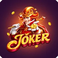
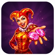
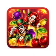
The main menu arrives with a female joker character — red curly hair, colorful jester costume, bells on the hat — surrounded by orange and yellow energy bursts on a dark purple field. The title glows in 3D red and white lettering. Promotional artwork introduces a second joker figure: a male character in a red and gold costume, holding coins in one hand and a wand with a golden orb in the other, set against a swirling backdrop of cherries, plums, oranges, and lemons. The color palette across both characters and both game modes stays consistent: deep purple, golden yellow, bright red, orange, white.
The fruit symbols that fill The Joker's cards — cherries, oranges, plums, the golden BAR — are the same shorthand vocabulary found across classic arcade and reel-based games. Players who've spent time with five-reel slot interfaces, where matching symbols across rows triggers glowing winning lines, will find the iconography immediately familiar, just repositioned into a grid you navigate with memory rather than chance.
Accessibility gaps worth knowing
The fruit symbols are differentiated almost entirely by color, which creates a real obstacle for color blind users — strawberries and apples, both red, sit next to each other with no shape-based distinction. Touch targets in the grid are small, which may cause difficulty for users with motor impairments. The animated effects on the start screen — lightning-like energy, glowing text, particle bursts — have no apparent option to disable them, a concern for anyone sensitive to flashing visuals. No accessibility settings menu is visible anywhere in the interface.