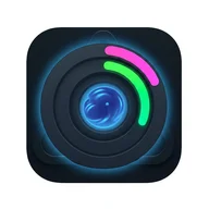
Twistral AquaRings opens with a profile setup that takes your name, age, weight (in lb or kg), and activity level — low, medium, or high — and uses those inputs to calculate a personalized daily water intake target. The goal isn't a generic recommendation; it's a number that shifts with you as your profile changes. From there, the main screen centers on a large circular progress ring that fills as you log water throughout the day, with preset options of 100 ml, 200 ml, 300 ml, and a custom amount available at each logging step.
Rings, Rewards, and the Feel of Progress
The hydration ring is the visual heart of the app. Colored segments — green and pink — fill around a swirling water vortex at the center, while golden multiplier badges and sparkle effects float nearby. It's a deliberately gamified presentation: logging water feels less like a health chore and more like building toward something. Achievements punctuate the longer arc — a "Hydration Hero" badge, for example, marks reaching 100% of your daily goal for 30 cumulative days, surfaced through a modal overlay with streaming light effects and congratulatory text. The statistics screen extends this further, showing current intake against your target, weekly completion (displayed as days out of seven), and a monthly calendar grid marked with blue droplet icons for each successful day.
Interactive Cards and the Discovery Layer
One of the less obvious features is a set of interactive cards that surface facts about water, the human body, and nature during regular check-ins. Rather than leaving the app as a pure logging tool, these cards introduce a small discovery element — each visit has the chance to teach you something unexpected. It's a light touch, but it adds texture to an experience that could otherwise feel repetitive over time.
A Visual Language Worth Noting
Fans of the spinning wheel game Twist will find the atmosphere here strangely familiar. That game also uses concentric multi-ring structures, a dark cosmic background, and a water element represented by a blue drop — the same color logic Twistral AquaRings uses for its progress indicators and droplet icons. Both lean into the satisfaction of watching rings fill segment by segment. The parallel isn't superficial; it's the same visual grammar of accumulation and reward applied to two entirely different contexts.
Where the App Has Room to Grow
The interface carries a real accessibility gap worth acknowledging. The bottom navigation relies entirely on icon-only buttons with no visible text labels, and the pink and green progress segments can be difficult to distinguish for users with red-green color blindness. Multiple overlapping animations — cosmic particle effects, flowing water streams, floating badges — run simultaneously, which may present challenges for users sensitive to visual complexity. There is currently no option to reduce or disable these background effects.
The gamification works well as a motivator, but the density of visual effects occasionally obscures the very progress information it's meant to celebrate.