Ice fishing has a way of punishing the unprepared. You drive out to a frozen lake at dawn, drill your hole, and then realize the one thing you left behind is the thing you needed most. Ice Fishy was built specifically to prevent that moment — it gives you a structured checklist you can run through before departure, covering your equipment and everything else that needs to be in order before you head out.
What the app actually does
- Provides a pre-departure checklist to go through your gear and supplies before leaving home
- Lets you check off items one by one so nothing gets overlooked in the rush
- Helps you structure your preparations in a clear, organized way rather than relying on memory
- Works equally well for beginners and experienced fishermen who want every detail under control
Design and feel
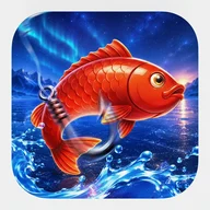
The app leads with simplicity. The loading screen sets the mood immediately — a semi-realistic winter landscape of snow-covered pine trees, a frozen lake surface with cracked ice, and a cyan sonar pulse animation playing over the water. The icon carries the same arctic energy: bold 3D lettering, leaping red-orange fish, an open tackle box, and scattered gold coins against snowy mountain peaks. Visually, it commits to the ice fishing atmosphere without cluttering the actual utility underneath.
Where the spinning wheel fits in
Beyond the checklist, Ice Fishy includes a prize spinning wheel — a game element with alternating red and blue segments labeled with fish categories like HUGE FISH, BIG ORANGE FISH, MEDIUM FISH, and a SECRET prize. A fishing rod serves as the wheel's pointer, and wins are announced in large golden 3D numerals — x180, x322 — with gold coins flying across the screen and celebration screens featuring a large golden fish character or an excited player avatar. The wheel mechanic shares its DNA with classic reel-based formats: the same anticipation of a pointer settling on a segment, the same burst of coins and light when a big multiplier lands.
A note on accessibility
Several areas would benefit from attention. The spinning wheel segments are differentiated by alternating red and blue colors only, which creates problems for users with red-green color blindness. Radio buttons and toggle switches communicate their selected state through color alone, without additional pattern or label support. The donut chart in the companion screens uses three closely related shades of blue. Some interactive elements — including radio buttons, checkboxes, and slider thumbs — may not meet the recommended 44×44 point minimum touch target size.